 |
Edited by Alison Davis Lyne
This page is meant to be a visual version of my verbal Art Tips section. I hope to highlight, with words and images, various art techniques. I also hope to have, from time to time, the art techniques of other illustrators. Since everyone's style is different, we will all use an art technique differently, so sharing techniques just enriches us all. If you want to submit an art technique tip, just let me know at alison@lyneart.com To see more of the end results of my artwork you can go back to my main section, and choose another catagory from the icons, which go to other pages on my website.
This art tip is the result of a sort of "pin ball machine" effect. (One person has an idea, who tells it to another person, who takes it, and changes it and comes up with another idea, and "bounces" it on to someone else.) Some while back I'd posted a verbal art tip on the usefulness of combining media, in this case acrylic glazes and watercolor. A few months later I got an email from Connie McLennan that read in part:I did just have a revelation triggered by reading the word "glazing" in your recent tips thread, though! I have been struggling with creating flow-y blobs that look like ink dispsersing in water, which are also permanent enough to allow me to paint the color of the water around them. Have been experimenting with watercolor and dyes, and was planning to spray them with workable fixative before overpainting -- before I read your thread and realized/remembered I could do exactly what I needed to do using thinned acrylics for the flowing blob colors, letting them dry, and painting the color of the water around them (hand slapping forehead.)
Which of course pleased me no end!
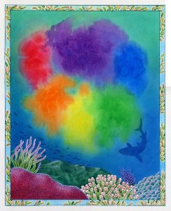
The subject that Connie McLennan was painting were pages for her latest book Octavia Octopus and her Purple Ink Cloud Sylvan Dell Publishing ISBN 0-9764943-5-3 April 2006. This is the title page showing the floating ink blobs that the book's heroine, Octavia, had made. It shows Connie's success in keeping the coloured "ink blobs" seperate, and not mixing and dulling the rainbow effect, and keeping them "in the water", but not mixing with the blues.
|
Connie was kind enough to allow me to use her images that show the use of her version of this "art tip" on keeping the flowing feeling of the "ink colors" while surrounding it with water,and not have the two mix. She also said about the pages below: "It was particularly important that the edges of the orange-yellow-red colors not mix with the (opposite) blue color of the water."
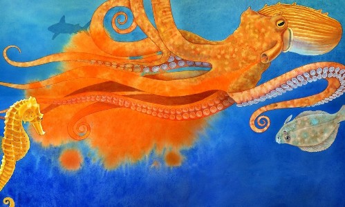 |
Reprinted by kind permission of Sylvan Dell Publishing and the illustrator Connie McLennan.
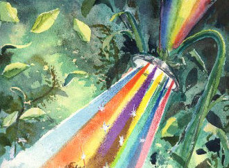
Of course the idea "pinball machine effect" is still in force, so......I thought I'd re-create Connie's effect, but with my own illustration "problem". I decided I wanted to do an illustration with the title: "Rainbow Shower." I wanted the rainbow water streams to be seperate cones of rainbow hues falling on the bathing "sprite". And have the surrounding green leaves to be "poured" colours of a woodland forest. I wanted the rainbow shower colors to be extra bright and translucent, so I choose fluid acrylic paints. The surrounding sunlit forest, I wanted a bit darker, subdued and mysterious, so I went with some granulating watercolors. I'd just read a book on "pouring" watercolor, so I thought I'd try that technique on the watercolor portion in this piece.
I began with my sketch of the sprite and the shower head spray on some watercolor board.. I then started in painting in the acrylic glazes (liquid acrylic paints mixed up in a acrylic glazing medium) in various cone shaped sections to make up the rainbow light streams of the "shower". For each coloured cone shape, I laid a piece of acetate for one straight edge and some masking scotch tape for the other side. These were used, then taken up and moved to a different location for each different colored stream of the shower. I had to wait a few minutes between each color for the paint to dry. Since I am painting seperate colors over a previously painted (and dried) colors, the colors blend optically, but not physically, so there is no muddying of the colors......like say between the yellow and violet streams,as there would be if it was all watercolor. No matter how dry the previous layer in watercolor, there is usually going to be some physical blending of the pigments. With the acrylic glazes, the colors are seperate, so they "glow"...... not combine and get muddy. I used a sponge brush roller on the first few sprays, to get an almost airbrushed effect. I used smaller sponges for the other colour cones in the spray.
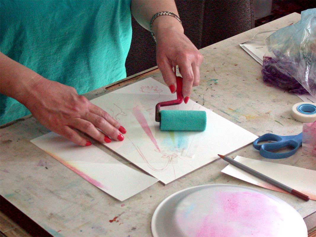 |
After the rainbow sprays were dry, I tried a new technique for me....I poured on some primary color glazes of watercolour. I also took some advice from a good friend Wanda Johnson and liberally used my spray bottle of water After a dose of salt crystals I let it all dry. I then put down some dots of liquid misket and poured some brite greens. Again, after drying I put down some leaf shapes in the liquid misket. And poured on the final darker/duller greens. At this point it looks a mess, but will hopefully begin to show promise after the misket, salt, and lines are cleaned up.
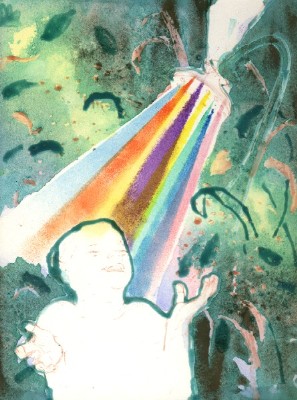 |
I removed all the misket, and made adjustments in the leaf shapes. I then watercolored the sprite, and adjusted the acrylic rainbow sprays with some colored pencil work, and a few acrylic "sparkles". And here is the finished illo "Rainbow Shower".
 |
return to - Lyne Art - Frank Lyne wood carvings - Alison Davis Lyne illustrations-Visual Art Tips page